Microsoft Excel has various chart features that can be used to display various data in graphical format. How ever, we do not some thing straight like the Speedometer. And this post would help you do it.
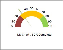
To add more sense to what I am speaking about, let me show the end result.Take a close look at the following figure.Yes this is what I am proposing to achieve on the Excel sheet.
Procedure:
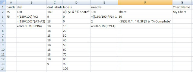
1. Create a new Excel sheet with the data as shown in the following figure. Make sure that you dont change the formulas in the cells, un less you are certain that you know what you are doing and can relate to the changes at any point of time during the creation of this Speedometer

2.Highlight the cells B2 to B5 and click on View->Other Charts->Doughnet as shown below
This will give you a chart like the one in the following.
Right Click on the doughnut chart thus created, select "Format Data Series". In the Series Options, mention the angle of first slice as 90 and click close. Now the chart will look like the one in the following
Right Click on the Doughnet chat,
click on "Select Data",
Click on "Add" to add a series,
Now in the Series Name field, give the value "Series 2",
click on the Series Value field and select cells, c2:c13 in the Excel sheet and say ok.
Now you will see a graph as displayed below.
Now goto the following url, download and install the tool,
http://j-walk.com/ss/excel/files/charttools.htm
This will work only in Windows
Use the add-in to format Series 2 to display data labels using the range D2:D14. Keep Series 2 highlighted, then double-click to bring up the Format Data Series dialog. Go to the Patterns tab, and select None for both the Border and Area. Your chart should look like that shown in the following figure
Now add a new series named "Series 3" with values "E2:E5" and say ok.
Now your graph will look like the following
image4
Now Right click on Series 3 and and
click "Change Series Chart Type..."
Click Pie chart and click ok
Now select the pie chart, right click on it,
click "Format data series"
In Series Options mention "Angle of first Slice" as 90 degrees,
in the Fill tab specify "No Fill" and in the Border Color tab, specify "No line".
Select the smaller slice of the pie chart and provide a fill color for it alone
Thus you will see the a graph similar to the following,
Now in the Excel sheet change the values of the cell F3 to some thing in between 0 and 100 and you will be able to see the graph changing
Also click on the unwanted labels and delete them to give a complete decent look. I have changed the values in the cell F3 to 40 and deleted a few labels somy graph looks like this,
!! Hope this helps you... !!


No comments:
Post a Comment